Change the type of input fields
The search form contains many input fields for Filters/Metadata and Annotations, and you can customize what widget is shown for each field.
Overview
Widget types can be set for:
- Metadata fields (filters)
- Annotation fields (token-level attributes)
Most widgest can easily be configured in the .blf.yaml file, but some widgets require a bit more work, as they need some extra data not available in the .blf.yaml file.
Annotations
Widgets for Annotations can be configured in two ways:
- By setting the
uiTypeof an annotation in the.blf.yaml - Through the JS customization API.
yaml
# NOTE: uiType in the `.blf.yaml` cannot be changed after creating the corpus.
# Changing it later requires manual editing of the index metadata (not recommended),
# or recreating of the index/corpus.
metadata:
  fields:
  - name: author
    uiType: select
  - name: year
    uiType: range
ts
function customizeUIType(
  annotatedField: NormalizedAnnotatedField,
  annotation: NormalizedAnnotation
) {
  // For example:
  switch (annotation.id) {
    case 'author': return 'select';
    case 'year': return 'range';
    default: return null; // use default
  }
}

frontend.customize(corpus => {
  // The function you set will be called for every shown annotation:
  corpus.search.pattern.uiType = customizeUIType;
})
Annotation Widgets
The following widgets are available for Annotations,
use the name of the tab as the uiType in the .blf.yaml file, or return it from the customizeUIType function.
Select (Dropdown)
Select is the default when an Annotation doesn't have very many values. Currently this is up to 500 values.
Unlike the Metadata select, this allows only a single selection.
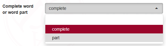
WARNING
When there are too many options we no longer load them all, and we automatically convert the widget back to autocomplete, so users don't inadvertently miss any options.
Metadata (Filters)
Widgets for Metadata can be configured in two ways:
- By setting the
uiTypeof a metadata field in the.blf.yaml - By manually creating the filter with a different type with the JS API.
yaml
metadata:
  fields:
  - name: genre
    uiType: checkbox
  - name: date
    uiType: date
ts
vuexModules.filters.actions.registerFilter({filter: {
  id: 'genre', // must match the metadata field name, except where otherwise stated
  componentName: 'filter-checkbox', // 'filter-' followed by the widget type

  displayName: 'Genre',
  description: 'Genre of the text',

  metadata: {} // extra info required for the widget. Differs per filter type, see below.
}});Select (Dropdown)
Select is the default when a Metadata field doesn't have very many values. Currently this is up to 200 values.
Unlike the Annotation select, this allows for multiple selection.
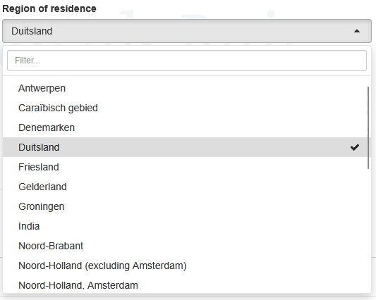
WARNING
When there are more options we automatically convert the widget back to autocomplete, so users don't inadvertently miss any options.